

Football Data Visualizations - Passing Networks
End to End Football Data Visualization
During Euro 2020 I've seen a lot of good-looking visualizations on Twitter (see those created by Maram AlBaharna and Matteo Pilotto). There's also plenty of other data scientist, some professional and some amateur, who create soccer data visualizations.
There are a lot of tutorials on how to create them. The most popular source of knowledge is the Friends of Tracking channel on YouTube but also the McKay Johns tutorials that simply explain the way of creating various visualizations. However, creating those diagrams, charts, and heatmaps is not a big deal. As Hemanth Tiru discovered in this tweet, the main problem is getting the data and cleaning it.
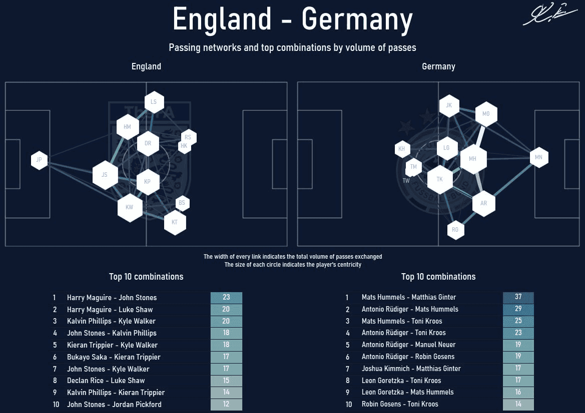
I've spent some time discovering where the data behind those visualizations on Twitter comes from. Few people said that they can't share this information with me but some helped me. I'll share the way of creating a passing network for a match between England and Germany of the Euro 2020 from gathering the data to the visualization.
There are many events and tracking data providers for soccer. The main ones are Opta, StatsBomb, Prozone, Metrica Sports, Wyscout, and others. Sadly the data is not publicly available and it is also not cheap. Only big organizations can afford it. Most of the amateur data scientists on Twitter use data scraped from WhoScored. WhoScored data is provided by Opta and it legally cannot be used by a third party. That's why users were not enthusiastic about sharing the information where they get the data. If you want to legally obtain permission for use of WhoScored.com content contact them here.
All the code as a jupyter notebook is available here.
Getting the Data
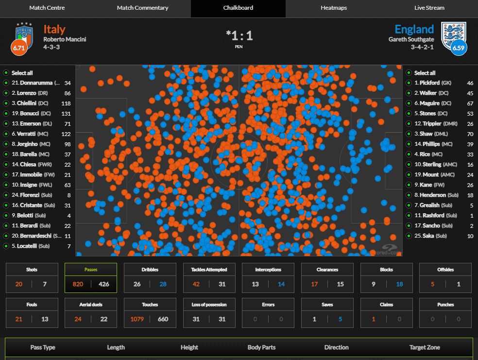
For selected competitions on WhoScored, you can access advanced statistics like passes from individual players, shots, dribbles, touches, etc. This is available for Premier League, Euros, World Cup, Champions League, and other big leagues and tournaments. Here you can see Italy vs England Euro 2020 final.
So, we know that the data of passes are available to us. But how to locate it? Let's check the source code of the website. We can see that the JSON with match data is stored directly in HTML.
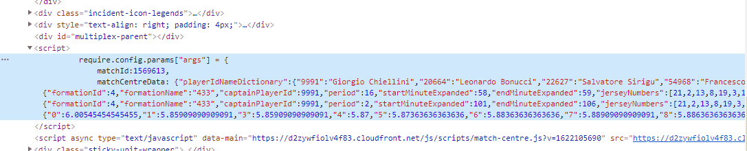
Firstly download the HTML of the given match from your browser by selecting Save as or by clicking CTRL+S. To extract the JSON from HTML use following the function which is based on regular expressions.
def extract_json_from_html(html_path, save_output=False):
    html_file = open(html_path, 'r')
    html = html_file.read()
    html_file.close()
    regex_pattern = r'(?<=require\.config\.params\["args"\].=.)[\s\S]*?;'
    data_txt = re.findall(regex_pattern, html)[0]

    # add quotations for json parser
    data_txt = data_txt.replace('matchId', '"matchId"')
    data_txt = data_txt.replace('matchCentreData', '"matchCentreData"')
    data_txt = data_txt.replace('matchCentreEventTypeJson', '"matchCentreEventTypeJson"')
    data_txt = data_txt.replace('formationIdNameMappings', '"formationIdNameMappings"')
    data_txt = data_txt.replace('};', '}')

    if save_output:
        # save json data to txt
        output_file = open(f"{html_path}.txt", "wt")
        n = output_file.write(data_txt)
        output_file.close()

    return data_txt
Expression r'(?<=require\.config\.params\["args"\].=.)[\s\S]*?;' selects the lines from first curly bracket after require.config.params to the end of the block. Then the data is processed to follow the json rules by wrapping names inside objects with quotation marks "".
In this way, we have extracted the match data from the HTML. The next step is getting the important records from the json we have extracted. Following function gets work done.
def extract_data_from_dict(data):
    # load data from json
    event_types_json = data["matchCentreEventTypeJson"]
    formation_mappings = data["formationIdNameMappings"]
    events_dict = data["matchCentreData"]["events"]
    teams_dict = {data["matchCentreData"]['home']['teamId']: data["matchCentreData"]['home']['name'],
                  data["matchCentreData"]['away']['teamId']: data["matchCentreData"]['away']['name']}
    players_dict = data["matchCentreData"]["playerIdNameDictionary"]
    # create players dataframe
    players_home_df = pd.DataFrame(data["matchCentreData"]['home']['players'])
    players_home_df["teamId"] = data["matchCentreData"]['home']['teamId']
    players_away_df = pd.DataFrame(data["matchCentreData"]['away']['players'])
    players_away_df["teamId"] = data["matchCentreData"]['away']['teamId']
    players_df = pd.concat([players_home_df, players_away_df])
    players_ids = data["matchCentreData"]["playerIdNameDictionary"]
    return events_dict, players_df, teams_dict
This way we have created a dictionary of match events, a pandas data frame with all players, and the dictionary of teams.
Data preparation
To visualize pass networks we need the data about passes. Ideally, we want the following information:
- who made the pass
- to whom (who received it)
- what was the outcome (success, intercepted, etc.)
- coordinates of the pass (from, to)
Sadly the WhoScored doesn't provide all the necessary info and we have to guess some parts of it. For example to guess who was the receiver we can get the next event of the match. It is highly probable that the receiver of the pass will be the man, who made the next pass in the match. The next function creates a data frame of passes.
def get_passes_df(events_dict):
    df = pd.DataFrame(events_dict)
    df['eventType'] = df.apply(lambda row: row['type']['displayName'], axis=1)
    df['outcomeType'] = df.apply(lambda row: row['outcomeType']['displayName'], axis=1)

    # create receiver column based on the next event
    # this will be correct only for successfull passes
    df["receiver"] = df["playerId"].shift(-1)

    # filter only passes
    passes_ids = df.index[df['eventType'] == 'Pass']
    df_passes = df.loc[
        passes_ids, ["id", "x", "y", "endX", "endY", "teamId", "playerId", "receiver", "eventType", "outcomeType"]]

    return df_passes
Then we want to summarize the passes between each player from two teams. Firstly we filter only starting 11 players, then we calculate their mean positions where they've created passes and lastly we gather how many passes were made between each pair of players. The following function does exactly this.
def get_passes_between_df(team_id, passes_df, players_df):
    # filter for only team
    print(team_id)
    passes_df = passes_df[passes_df["teamId"] == team_id]

    # add column with first eleven players only
    passes_df = passes_df.merge(players_df[["playerId", "isFirstEleven"]], on='playerId', how='left')
    # filter on first eleven column
    passes_df = passes_df[passes_df['isFirstEleven'] == True]

    # calculate mean positions for players
    average_locs_and_count_df = (passes_df.groupby('playerId')
                                 .agg({'x': ['mean'], 'y': ['mean', 'count']}))
    average_locs_and_count_df.columns = ['x', 'y', 'count']
    average_locs_and_count_df = average_locs_and_count_df.merge(players_df[['playerId', 'name', 'shirtNo', 'position']],
                                                                on='playerId', how='left')
    average_locs_and_count_df = average_locs_and_count_df.set_index('playerId')
    print(average_locs_and_count_df)

    # calculate the number of passes between each position (using min/ max so we get passes both ways)
    passes_player_ids_df = passes_df.loc[:, ['id', 'playerId', 'receiver', 'teamId']]
    passes_player_ids_df['pos_max'] = (passes_player_ids_df[['playerId', 'receiver']].max(axis='columns'))
    passes_player_ids_df['pos_min'] = (passes_player_ids_df[['playerId', 'receiver']].min(axis='columns'))

    # get passes between each player
    passes_between_df = passes_player_ids_df.groupby(['pos_min', 'pos_max']).id.count().reset_index()
    passes_between_df.rename({'id': 'pass_count'}, axis='columns', inplace=True)

    # add on the location of each player so we have the start and end positions of the lines
    passes_between_df = passes_between_df.merge(average_locs_and_count_df, left_on='pos_min', right_index=True)
    passes_between_df = passes_between_df.merge(average_locs_and_count_df, left_on='pos_max', right_index=True,
                                                suffixes=['', '_end'])
    return passes_between_df, average_locs_and_count_df
Visualization
Firstly we will prepare the function which draws the pass network onto the pitch based on the data frame of exchanged passes and average locations.
def pass_network_visualization(ax, passes_between_df, average_locs_and_count_df, flipped=False):
    MAX_LINE_WIDTH = 10
    MAX_MARKER_SIZE = 3000
    passes_between_df['width'] = (passes_between_df.pass_count / passes_between_df.pass_count.max() *
                                  MAX_LINE_WIDTH)
    average_locs_and_count_df['marker_size'] = (average_locs_and_count_df['count']
                                                / average_locs_and_count_df['count'].max() * MAX_MARKER_SIZE)

    MIN_TRANSPARENCY = 0.3
    color = np.array(to_rgba('#507293'))
    color = np.tile(color, (len(passes_between_df), 1))
    c_transparency = passes_between_df.pass_count / passes_between_df.pass_count.max()
    c_transparency = (c_transparency * (1 - MIN_TRANSPARENCY)) + MIN_TRANSPARENCY
    color[:, 3] = c_transparency

    pitch = Pitch(pitch_type='opta', pitch_color='#0D182E', line_color='#5B6378')
    pitch.draw(ax=ax)

    if flipped:
        passes_between_df['x'] = pitch.dim.right - passes_between_df['x']
        passes_between_df['y'] = pitch.dim.right - passes_between_df['y']
        passes_between_df['x_end'] = pitch.dim.right - passes_between_df['x_end']
        passes_between_df['y_end'] = pitch.dim.right - passes_between_df['y_end']
        average_locs_and_count_df['x'] = pitch.dim.right - average_locs_and_count_df['x']
        average_locs_and_count_df['y'] = pitch.dim.right - average_locs_and_count_df['y']

    pass_lines = pitch.lines(passes_between_df.x, passes_between_df.y,
                             passes_between_df.x_end, passes_between_df.y_end, lw=passes_between_df.width,
                             color=color, zorder=1, ax=ax)
    pass_nodes = pitch.scatter(average_locs_and_count_df.x, average_locs_and_count_df.y,
                               s=average_locs_and_count_df.marker_size, marker='h',
                               color='#FEFEFC', edgecolors='#FEFEFC', linewidth=1, alpha=1, ax=ax)
    for index, row in average_locs_and_count_df.iterrows():
        print(row)
        player_name = row["name"].split()
        player_initials = "".join(word[0] for word in player_name).upper()
        pitch.annotate(player_initials, xy=(row.x, row.y), c='#C4C4C4', va='center',
                       ha='center', size=14, ax=ax)

    return pitch
Lastly, we create the plot.
# create plot
fig, axes = plt.subplots(1, 2, figsize=(15, 8))
plt.subplots_adjust(left=None, bottom=None, right=None, top=None, wspace=None, hspace=None)
axes = axes.flat
plt.tight_layout()
fig.set_facecolor("#0D182E")
# plot variables
main_color = '#FBFAF5'
font_bold = FontManager(("https://github.com/google/fonts/blob/main/apache/roboto/static/"
"RobotoCondensed-Medium.ttf?raw=true"))
# home team viz
pass_network_visualization(axes[0], home_passes_between_df, home_average_locs_and_count_df)
axes[0].set_title(teams_dict[home_team_id], color=main_color, fontsize=14, fontproperties=font_bold.prop)
# away team viz
pass_network_visualization(axes[1], away_passes_between_df, away_average_locs_and_count_df, flipped=True)
axes[1].set_title(teams_dict[away_team_id], color=main_color, fontsize=14, fontproperties=font_bold.prop)
plt.suptitle(f"{teams_dict[home_team_id]} - {teams_dict[away_team_id]}", color=main_color, fontsize=42, fontproperties=font_bold.prop)
subtitle = "Passing networks and top combinations by volume of passes"
plt.text(-10, 120, subtitle, horizontalalignment='center', verticalalignment='center', color=main_color, fontsize=14, fontproperties=font_bold.prop)
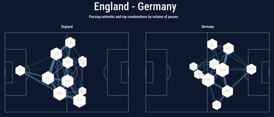
plt.show()Which gives us the following plot.
Summary
In this blog post, we have presented how to gather the data from WhoScored, prepare it and plot the pass networks of two teams side by side. All the code as a jupyter notebook is available here.